BOULDER CITY GUIDE
Skills:
graphic, layout, and publication design, bookbinding
Tools Used:
Adobe InDesign, Photoshop, Illustrator
Course:
Images in Communication (DES 321)
Duration:
3 weeks
How can I craft a visually captivating
coffee table book? In what ways can I visually and rhetorically convey the essence
of a city?
My role: designing and assembling the book
INTRODUCTION
The city of Boulder, Colorado holds a special place in my heart. It is it's where my twin sister attends school, and my family and I have been fortunate enough to visit on several occasions, making it even more meaningful to us. Nestled at the foot of the iconic Flatirons, Boulder is located between busy Denver and the majestic Rocky Mountains - a prime setting for a charming, historic college town. The city's uniqueness and blissful atmosphere can be attributed to its exceptional weather, the warmth of its people, the vibrant music and art scene, and the infectious energy it exudes.
For this project, I was tasked with designing, printing, and assembling a city guide for my chosen city. My plan was to create a web version (pdf) and a printed version (book) I would cut and bind myself. I also planned on creating a branding system that would include typography, color, iconography, and images that pertain to my city.


BRAINSTORMING
When considering which city to feature in my city guide, I reviewed options in the United States and cities in Colombia, where my family is from. Eventually, I settled on Boulder. I chose this city because it's a new and intriguing place for both my family and me, and I was eager to explore and understand what my sister finds captivating about it. My goal was to immerse myself in my sister’s daily life and uncover the essence of this city.
To avoid the conventional pamphlet, brochure, or magazine-style city guide, I opted for a unique and more demanding approach. I embraced the challenge of expanding the guide with additional pages and extending the design theme to cover a wider range of city topics and niches. After pondering whether or not I should do a coffee table book, and give myself that much work to do, I concluded: a coffee table book nicely encapsulates the vibe of the Boulder lifestyle: artistic, mellow, and down-to-earth. So I decided to take on the challenge.
RESEARCH
My research included looking at hotels, restaurants, ski spots, hiking trails, and everything else a city guide needs. I took the extra step of picking a target audience for the guide: college students. Adding bookstores, skateparks, bars, and dispensaries was a risky, but realistic addition. When venturing into a new city, relying solely on Google Maps or Safari for recommendations aimed at travelers and adults might not be the most fitting approach. The ultimate Boulder advice comes from a Boulder native or a CU college student.


COVER DESIGN
At first, I wanted the front cover to resemble a user’s manual or vintage book to reference the mining history of the town, but it didn't feel imaginative enough for me.
The new front cover shows a dreamy scene that came to me while my head was down in the middle of class. Taking a nap? Possibly. During class? Absolutely not, I was brainstorming! While trying to imagine how the city of Boulder makes me feel, I thought of what my sister calls it - "Sugar-plum Fairyland", comparing it to the magical winter wonderland world in “The Nutcracker”. A place where everyone is happy and your imagination runs wild. A place where the vast mountains hug you in like a blanket and the snow-covered treetops shimmer in the moonlight. All that I could think about for the front cover design was nature and the fantastical imagination that Boulder breeds.
The front cover shows the view of the Rocky Mountains from Boulder, a giant crescent moon, and floating hiking trails layered on top of the scene.
LAYOUT
Going into the layout portion of this project, I knew I wanted my layouts to be modern and playful. I also wanted to utilize white space along with most of the images used being ones I have taken while in Boulder. I hoped this book to be aesthetically pleasing to look at, so I decided to use only one color, a light, icy blue to pop out from the neutral cream background. I began by analyzing modern magazine layouts for home, lifestyle, and fashion.
Through this, I discovered the very real use of grids in modern publications and the value of negative space. (Positive space??) Knowing this, I also knew I wanted to include photos on most pages. Because of this, I spread out the information into two pages, or one spread per topic. Another step I took was making the titles humorous. Utilizing Gen Z humor, I used some contemporary memes and iconic video quotes for the titles. Even though a few of the phrases I used are cringe and overused, they would be recognizable as a young author and translate into the reader trusting that the author knows the city.


SPECIFICS
The table of contents is visually pleasing and makes sure to acknowledge the history of the Indigenous communities that are native to Boulder. The history page includes seven sections: the settlement of Boulder, the mining industry, the birth of Chautauqua, University history, Boulder’s accomplishments in science and space, the black community, and the hippie movement in Boulder. The Hiking page includes beautiful imagery of the flatirons and symbolic representations of each trail’s level of difficulty. The music page includes many different music venues (big and small) in a formation resembling industrial music speakers. “Rocky Mountain High”, or the ski spots page, includes a photograph I took while skiing in Boulder and references John Denver’s iconic song about Colorado’s beautiful scenery, which was named one of the two official state songs in 2007. The “University Spots” page features a campus map and the Nutcracker reference “Sugar Plum Fairyland”. The weed page references Dominic Fike’s 2023 hit single, “How Much is Weed”, to incorporate some modern music references. A page like this is fitting for a place where marijuana is legal and features safe places to get cannabis products. Pages 37 and 38 dive into my twin sister’s knowledge of Boulder, highlighting nature spots, restaurants, and past residences. The final page is a nod to my sister’s group of friends who ironically call themselves the “Boulder Baddies”. It was a fun addition and proved to be a hit as I sent a book copy to her.
PRINTING
The next step was to plan my printing process. I made two mockups to envision what the book would look like in its final physical form. The book pages and cover were 6.5 by 8.5 inches and I needed to experiment with printing materials to figure out the exact spine measurement. I created a list of questions that I came across during this process.
⭐ How will I translate the web version to a printed version? ⭐
I generated PDFs for all the pages, removing the cream background and presenting only the crisp blue ink design. I did this because I knew I wanted to print onto cream cardstock rather than flimsy white printer paper. I also knew the blue would be darker and more legible in print.
⭐ Should I outsource or print and bind the book myself? ⭐
I was very tempted to outsource the printing especially since so much time and effort went into the graphics for this project. It would take all the pressure off of me and allow them to do all the nitty-gritty steps of bookbinding. I ultimately decided against this, however, because publication design and print media are things I have an interest in pursuing, so I decided to tackle it head-on.
⭐ Where do I get the materials? ⭐
After traveling to Office Depot and two different Paper Sources for thin, good-quality cream paper at 11x17, I came home empty-handed. Consequently, I decided to use materials from the design lab in the art building.
⭐ What materials should I use? ⭐
Because of the time crunch, I only had time to make one book, so I had one chance to get it right. In the design lab, I planned to cut 50 sheets of cardstock, but the industrial guillotine wasn't working. So I moved over to the hand blade to cut all the sheets in groups of two or three.
⭐ How should I print? ⭐
After realizing the Epson printer in the print lab was broken, I went to my locker, grabbed the paper I cut, and went looking for the nearest printer. I ended up at the standard one downstairs. I had to pay for each page but I was just happy to finally have a printed version.

BOOKBINDING
⭐ How does the process of constructing a book differ from that of a pamphlet? ⭐
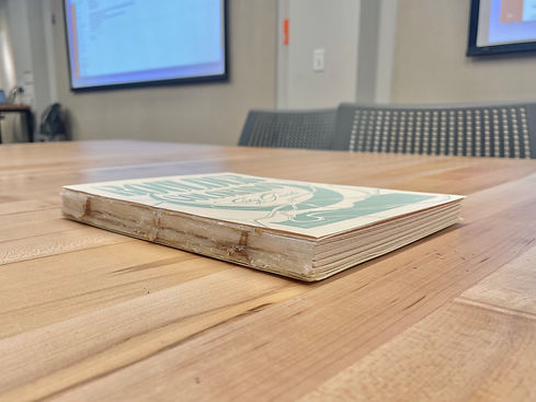
I cut the prints to the 6.5” x 8.5” size, bound them together with string, wax, and hot glue. I then constructed the book with a visible spine to show its construction. It was a thick one, but it was ready for presentation.
CONCLUSION
In reflecting on my recent experiences, I've gained valuable lessons that have significantly influenced my approach to projects. Firstly, I've come to appreciate the importance of planning ahead and not procrastinating, realizing the pitfalls of leaving the majority of the work until the night before a project deadline. Additionally, I've learned the practicality of creating multiple copies of the final book during the publication design process. This precautionary measure helps identify and rectify any construction mistakes, ensuring a flawless end result. I've also discovered a deep passion for publication and layout design, finding immense joy in the process. Connecting with my target audience is a priority for me, as I genuinely enjoy being funny and relatable in my designs. One aspect that brings me particular satisfaction is the incorporation of whimsical and dreamy visuals into my graphic design work. Despite being my first foray into bookbinding, I surprised myself with the skills and creativity I brought to the project, marking a significant personal achievement.

FINAL PRESENTATION


