PERSONAL LOGO DESIGN
(3d Visualization)
Skills:
graphic design, visual identity, personal branding, 3d design
Tools Used:
sketchbook, Adobe Illustrator, Blender
Assignment:
personal branding assets
Duration:
1 week
How can I use Blender to create new assets to further my
personal brand?
My role: designing, sculpting, and rendering the logo
IDEATION

For this assignment, we were tasked with creating a personal logo. My first name, Vivian, means “alive”. My middle name, Marina, means “one of the sea”. My last name, Montoya, roughly translates to “hills and valleys”, named after a hamlet near Berantevilla in Álava, in the Basque region of northern Spain. I am half European and half Colombian. I like to think I am artistic, open-minded, calm, thoughtful, and creative. Some of my favorite things are the color green, silver chrome material, the number twelve, yoga, aquatic animals, music, smoothies, sushi, and pasta. My fears can be scientifically classified as odontophobia and thalassophobia (fear of the ocean and fear of dental work).
TYPOGRAPHY


I explored many different typefaces, but none seemed to stick or interest me. They all felt too simple for what I wanted to portray in my personal brand.
SKETCHING

I decided to create a logo that was unique and organic, different than any typeface I had seen.
DIGITIZING
I put the sketch into Illustrator and vectorized the letterforms. Here I was also able to perfect the curves of the letterforms.
LOGO


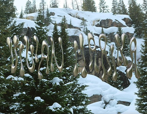
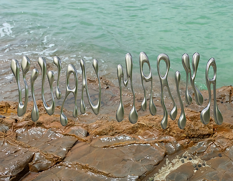
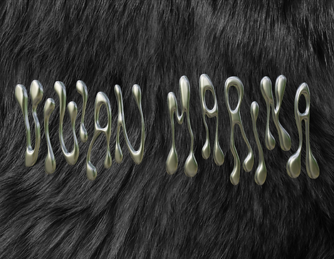
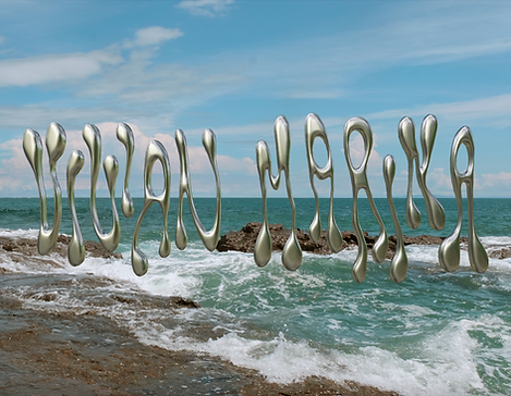
I made some drastic changes when creating my personal logo. I knew I wanted a sans-serif font, and an inconsistent cap line and baseline. I also wanted very little kerning. I wanted all uppercase characters for a clean and smooth look. In order to create a visually descriptive logo, I looked into the meaning of my name. My first name, Vivian, means “alive”, and my middle name, Marina, means “one of the sea”. The irony here is that I have Thalassophobia, or fear of the ocean. Based on this, I wanted to create a custom typeface that mimicked the characteristics of sea creatures. The keywords I based my analysis on were metamorphosis, movement, growth, flourishing, organic, biological, awake, and conscious. I created text to embody these words by warping the font I chose into unique shapes I sketched out in my sketchbook. I knew I didn’t want any straight-line stems, so I chose organic shapes for my letters. I chose the colors for my logo because they are commonly found in coral reefs and aquatic plants. They are also colors I tend to gravitate toward when designing.
3D

To take it one step further, I decided to bring my logo into Blender to create a 3D version. This added depth and dimension, further enhancing the "alive" feel I aimed to achieve. The final version is a pink chrome logo floating in the sky.
UPDATES
A few months later, I updated my personal branding to be Vivian Marina, my first and middle name, instead of my first initial and middle name. I updated the vectors, and made it in 3d too.


FINAL PRESENTATION